Halden Advisory
A redesign concept that turns a cluttered tax consultancy homepage into a clear, editorial site focused on services and consultations.
- Client
- Halden Advisory (fictional brand)
- Status
- Self-initiated concept
- Services
- Website redesign, Web design
- Year
- 2026
Project background
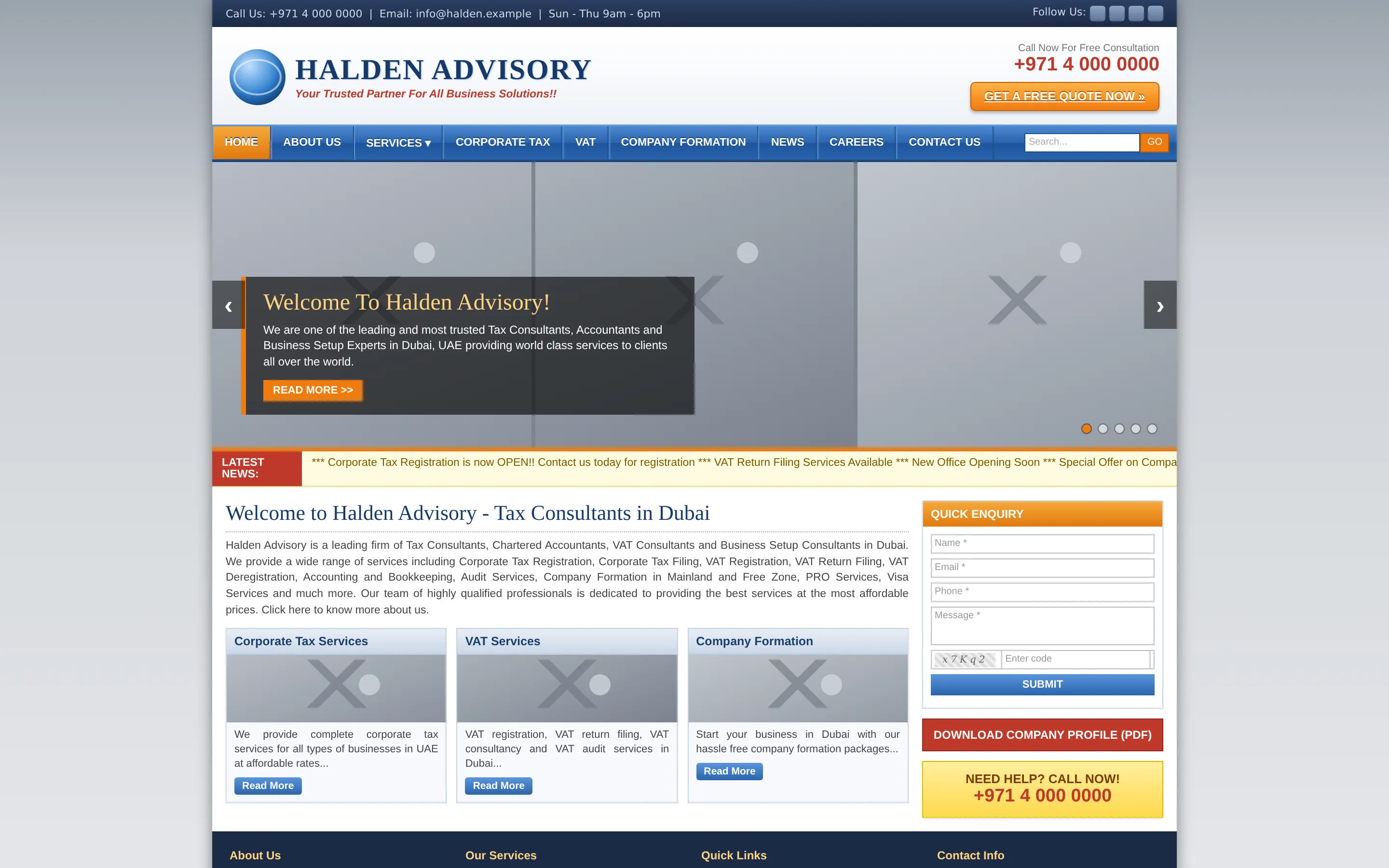
Halden Advisory is a self-initiated concept project, and the brand is fictional. We created it to show how we would approach a website redesign for a UAE consultancy offering corporate tax, VAT and company formation services. The “before” homepage was also designed by us for this concept. It is an illustration of a layout we often see on older professional services sites, not a copy of any real company’s website.
Business objectives
The firm’s work is technical, but its clients are mostly founders and finance managers who want to know three things: can you help with my situation, what will it cost, and what happens next. The redesign needs to answer those quickly, reduce the number of competing buttons to one main action, and give the firm’s written guidance a proper home.
Design strategy
The before state shows the typical problems: small, justified text, a slider of grey placeholder images, a scrolling news ticker, a glossy menu with nine top-level items and five different calls to action on one screen, from a free quote to a brochure download. Nothing is wrong in isolation, but together it makes the firm look busier than it is careful.
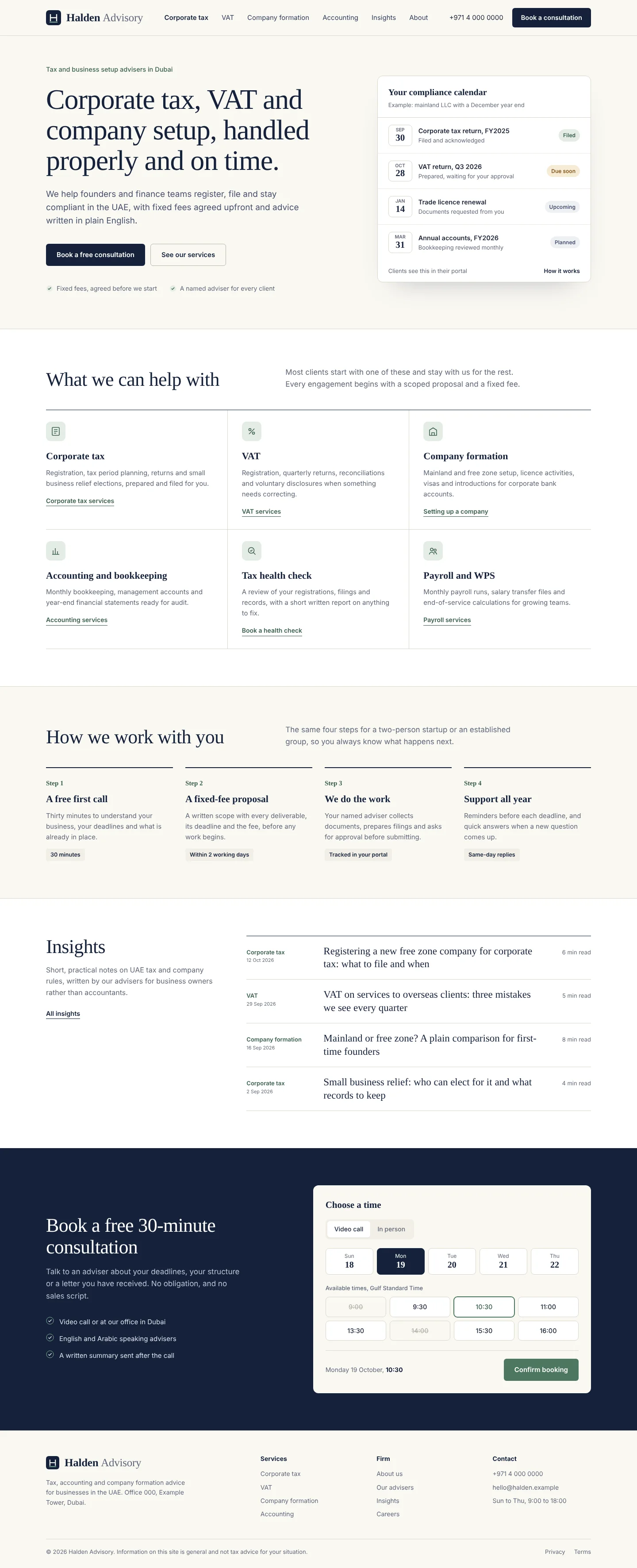
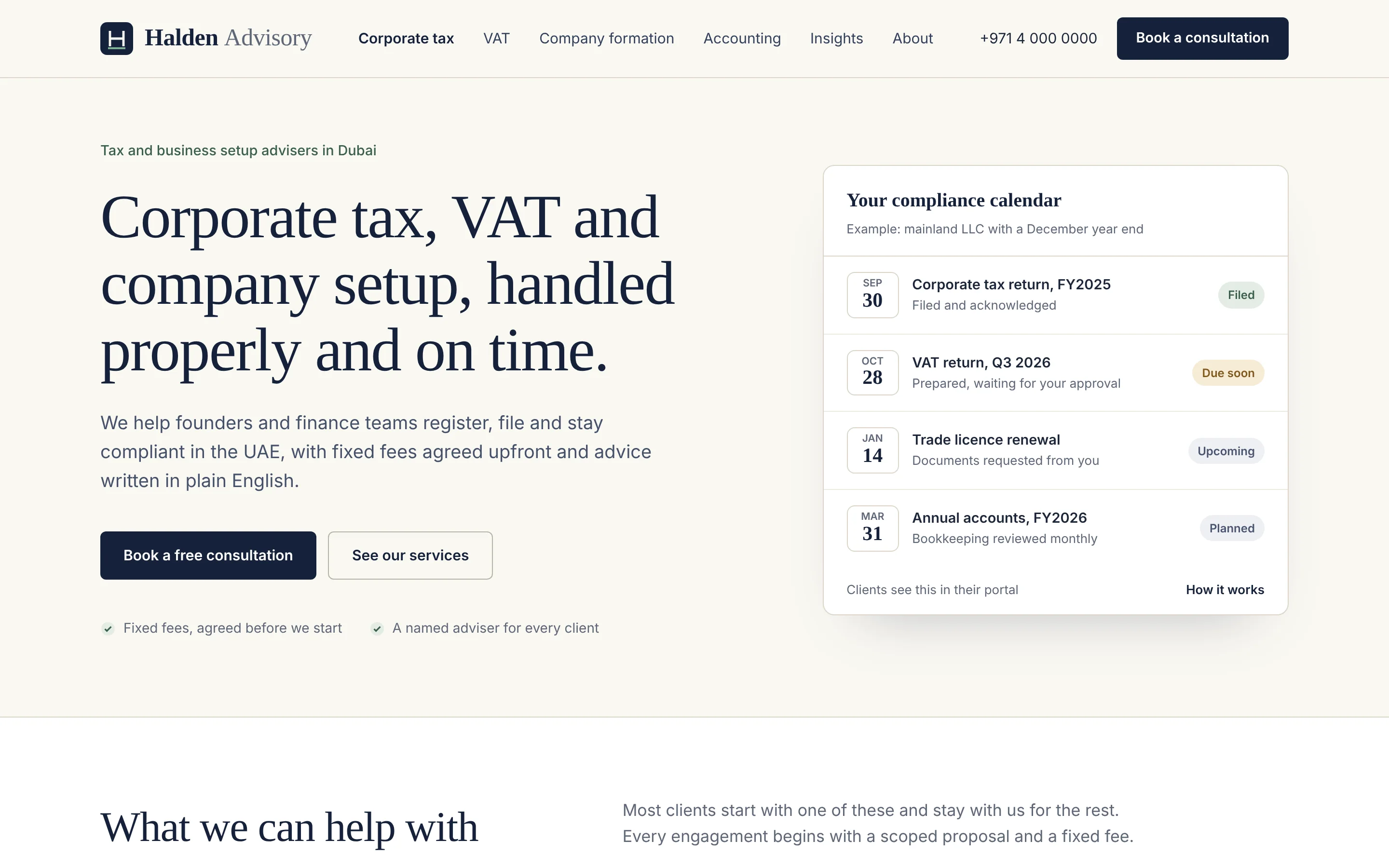
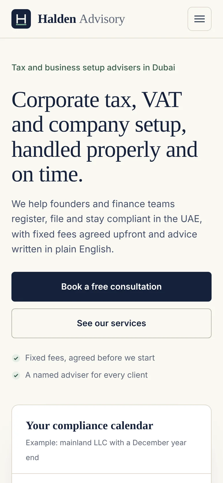
The redesign is calm and editorial. Ink navy, paper white and a muted green set a trustworthy tone, with Bitstream Charter for headlines and Inter for interface text. The hero states the service promise in one sentence and offers two actions: book a free consultation or see services. Beside it, an example compliance calendar shows the kind of deadlines a client would see in their portal, which explains the service better than a stock photo could.
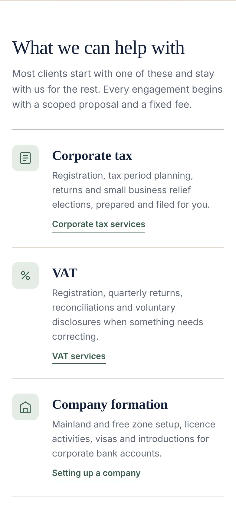
Services are presented as six tiles with plain descriptions. A four-step process explains how an engagement runs, including the fixed-fee proposal. Insights are listed with category, date and reading time, and the page ends with a booking panel where visitors choose a call type, day and time.
Development approach
For a redesign, protecting existing search visibility comes first. We would audit current pages and rankings, keep URLs that perform, and map every retired URL to its closest new page with permanent redirects. Service pages and insights would move into a CMS with authors, dates and categories, and each article would carry article structured data.
The booking panel would connect to the firm’s calendar tool so availability is live. Text sizes, line lengths and colour contrast are set for comfortable reading, and the layout works with a keyboard. On mobile, service tiles become a compact list and the main buttons go full width.
What this concept demonstrates
It shows how we would approach a redesign for a professional firm: identify what is getting in the way, simplify the journey to one clear action, and carry content and search equity safely into the new site.
Selected screens