Saffa Bakehouse
A warm, bilingual brand identity concept for an artisan bakery, from logo and palette to cards, menus, packaging and social posts.
- Client
- Saffa Bakehouse (fictional brand)
- Status
- Self-initiated concept
- Services
- Logo design, Brand identity, Business cards, Brochure
- Year
- 2026
Project background
Saffa Bakehouse is a self-initiated concept project, and the brand is fictional. We created it to show how we would approach a brand identity for a small artisan bakery opening a shop in Dubai, selling sourdough, sesame ka’ak and a signature pistachio and rose swirl. A bakery brand is seen at close range every day, on bags, cups, stickers and phones, so it has to be warm, simple and consistent everywhere.
Business objectives
The identity needs to feel crafted without looking like every other bakery, work in English and Arabic from day one, and hold up at very small sizes. It also has to be practical: the team should be able to produce a new menu or social post without starting from scratch.
Design strategy
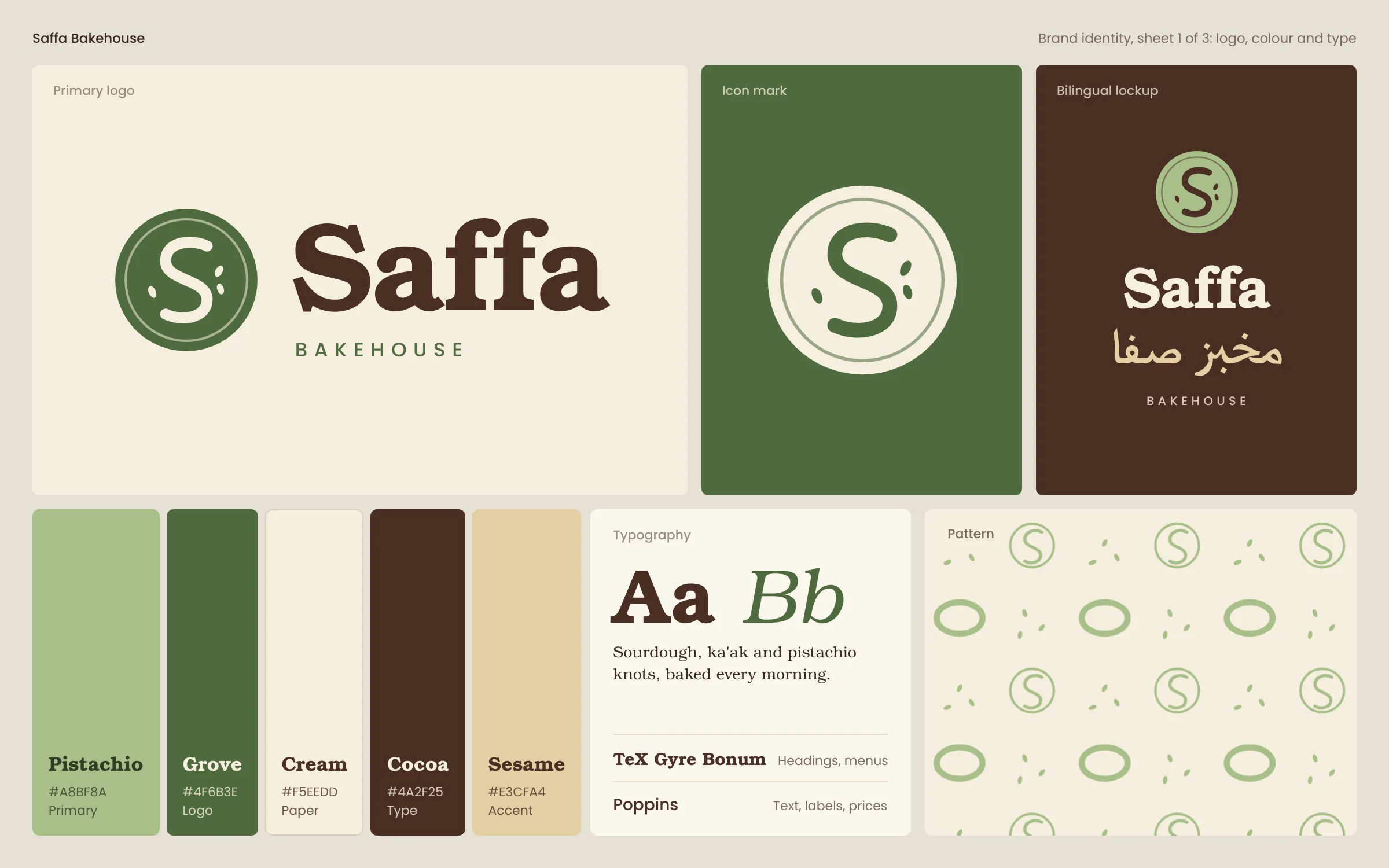
We avoided the usual wheat and terracotta palette and built the colours around the bakery’s signature bake instead: pistachio and a deeper grove green, with cream, cocoa and sesame. Each colour has a defined role, from logo and text to paper and accents.
The icon mark is a round loaf with an S-shaped score and three sesame seeds. It works as a stamp, a sticker and a social avatar, and pairs with a bold wordmark in TeX Gyre Bonum, whose warm, rounded serifs suit the subject. Poppins handles labels, prices and body text. The bilingual lockup stacks the English wordmark above the Arabic name, with a shared spaced caption. A repeat pattern made from the score mark, ka’ak rings and seeds gives packaging and backgrounds texture without competing with the logo.
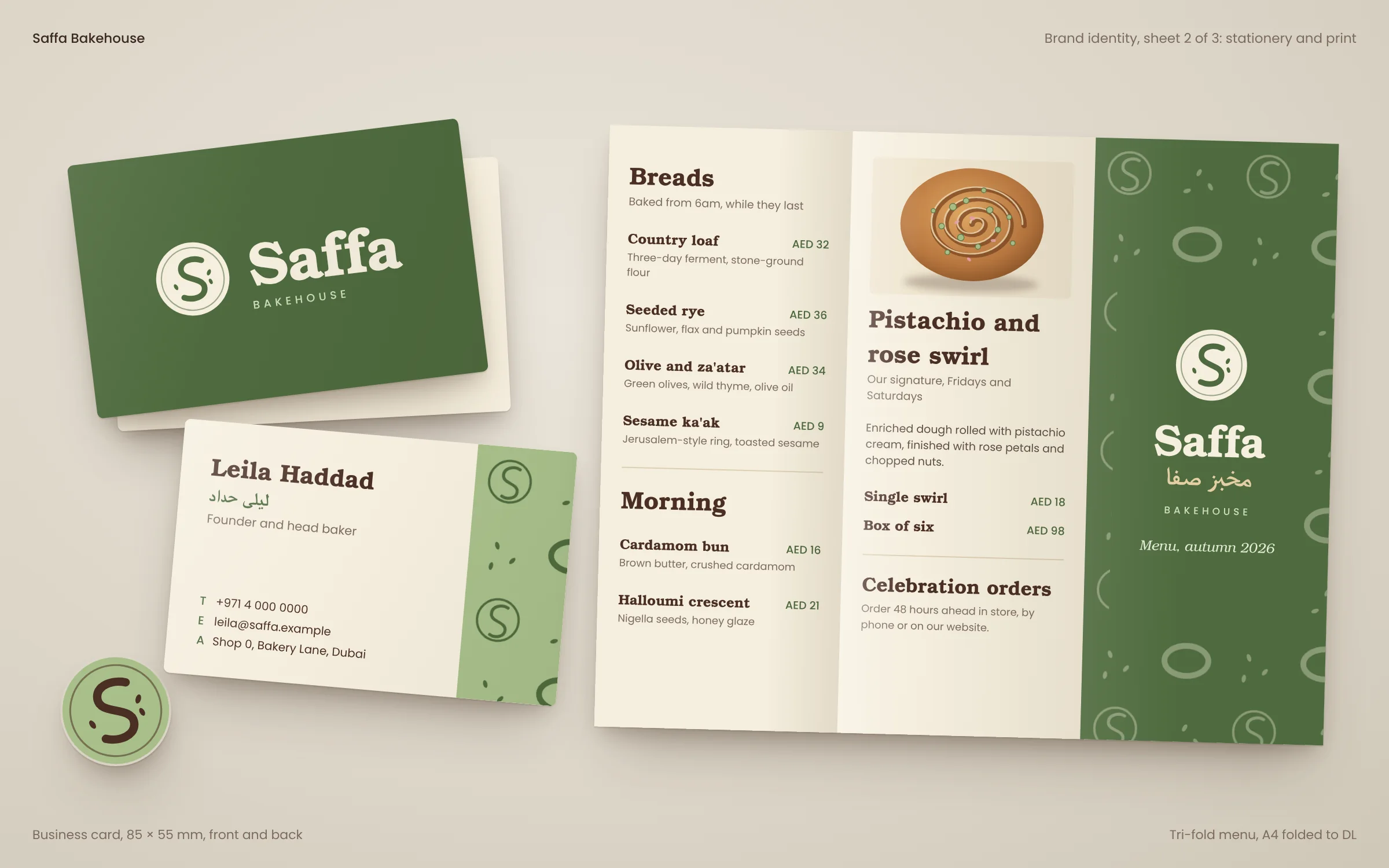
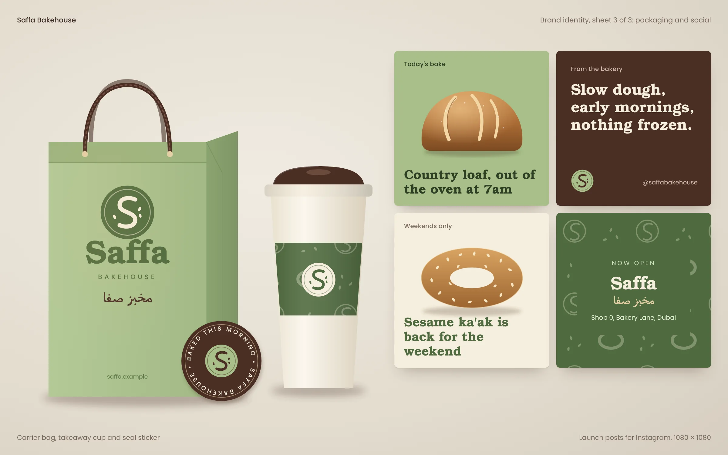
The applications show the system at work: business cards in grove and cream, a tri-fold menu with clear prices in AED, a pistachio carrier bag, a takeaway cup with a patterned sleeve, a round seal sticker, launch posts and a link-in-bio page for Instagram.
Development approach
For a real project we would supply master logo files in vector formats, colour values for screen and print, and print-ready artwork for cards and menus with bleed and crop marks, checked with the chosen printer. The Arabic in this concept is set in a general-purpose typeface; in a live project we would select or commission an Arabic typeface that matches the weight and character of the English wordmark, reviewed by a native Arabic designer.
Social and menu templates would be delivered in an editable format the team already uses, with locked brand elements and editable text. A short guidelines document would cover clear space, minimum sizes, colour pairings with accessible contrast and examples of correct and incorrect use.
What this concept demonstrates
It shows how we would build a small business identity as a working system rather than a single logo: distinctive, bilingual, and ready to use across print, packaging and social media from launch.
Selected screens